S412 Fashion Blog 03
⋆.˚✮AUDREY。✴︎˚。⋆
Dearest Readers,
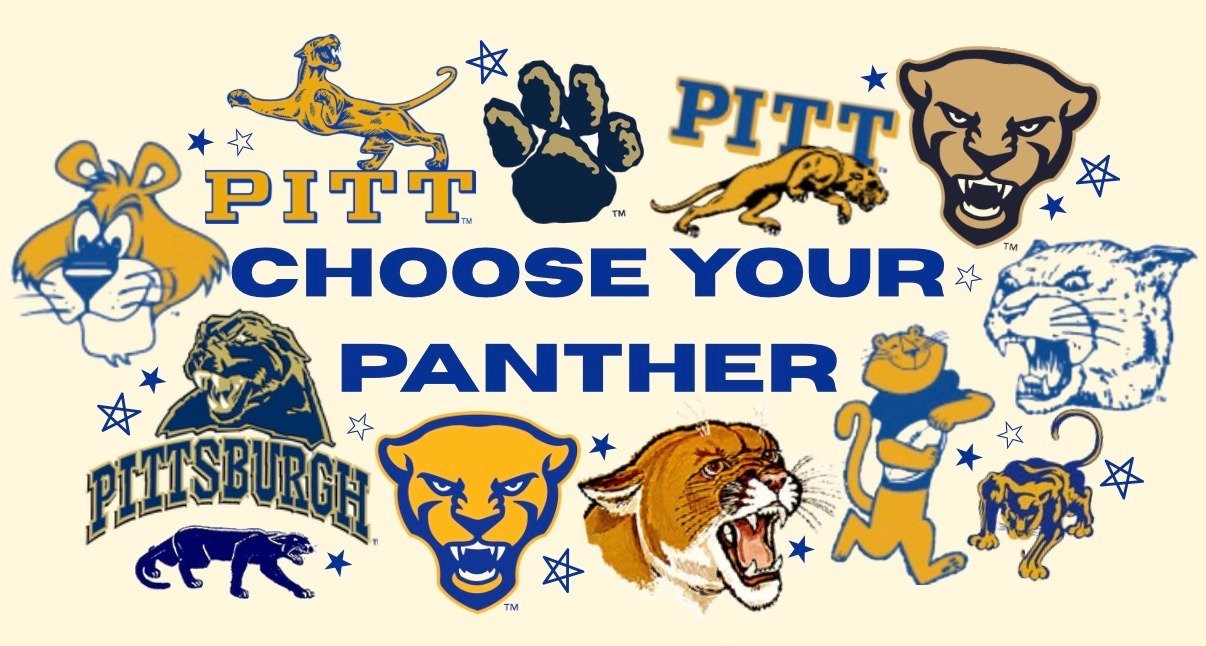
I guess I’m going to say it. I prefer the retired navy and gold Pitt used to employ as its color scheme. I just think it looks so much more dignified. I prefer the retro-looking logos instead of the modern yellow panther mascot we have now (which looks nothing like Roc, but the old ones don’t either). I have to say, though, despite my distaste for the blue and gold color combination, my favorite panther of all time is the secondary logo from 1959 that appeared on the cover of the 1959 football media guide:
I think he’s perfect. His late 50s mod design has charm, and his image is in motion and dynamic. He’s well proportioned and geometrically balanced. This panther is familiar, friendly and approachable! Smiling whether he wins or loses!
Another favorite of mine is this panther that looks more like a cougar, used from 1966 to 1972. His snarling face is turned ¾ to the right and he’s the only panther in Pitt’s history to use neither blue or gold in the design. While not necessarily symbolic of Pitt, I think this particular artistic rendition is the best looking roaring panther we’ve had.
Compared to this panther head used from 1977 to 1987, the brown panther seems much more representative of an actual panther, while this one looks like some sort of bobcat.
I really enjoy this alternate logo used from around 1970-1976. While I think the ‘PITT’ text on his hide is a bit on the nose, I like his stance and classic golden
coloring.This version of the panther logo from 2006 is a modified version of the first navy and gold panther designed in 1997. The modification was an attempt to give the old design a sleeker look. However, all of the contour lines in this composition are confusing and don’t give much dimension to the design at all. Although I will admit I prefer the navy and gold color scheme, this iteration of the modern navy panther just
looks like a dog.
Finally, the panther we all know today was designed in 2017 after Pitt commissioned the Nike Global Identity Group to update the team colors and logo for athletic apparel. It may not be the worst of the bunch, but I find this logo simplistic and lacking in character.

The current panther logo looks much better, in my opinion, edited with the old navy and gold colorway.

S412’s Guilia and Andie sport different variations of Pitt’s ever-changing color combo.
⋆˚SOPHIA ˚꩜。⋆
Truthfully, this week’s theme has been a bit of a struggle for me. I’m just not a huge fan of Pitt’s current blue and gold color combo. It’s often a huge effort for me to try and style my Pitt merch in a way where the bright yellow doesn’t make my skin tone look almost grey. When I walk around campus and see traces of the old Pitt colors, the navy and yellow ( which I feel looks a lot more like gold), I feel a bit jealous of the Panthers of the early 2000s who saw that color scheme daily.
It turns out though, that from 1997-2019 when these were our school's colors, they were widely hated. The rebrand was intended to upgrade the schools image after a rough losing streak in the 90s. But when the DinoCat was unveiled, the Pittsburgh Post Gazette released an article entitled “Pitt’s not it.” Many students and community members felt the rebrand only emphasized the school's struggles.
While this may be true, I can’t help but love the DinoCat, and I am always drawn to designs that include him. I frequently see DinoCat at thrift stores and vintage pop up events, with local artists like Pitt alum @elcon_threads collecting and using it in his designs. While this logo was
only around for about eight years, it has definitely been solidified as one of Pitt’s most iconic images.
I can’t help but wonder if Audrey and I’s disdain for the current logo and color is a continuation of a long pattern of discourse amongst Pitt’s community. Whilst neighboring schools like Duquesne and Carnegie Mellon have kept their symbols, crest and colors (such as the iconic D and CMU plaid) relatively the same over the past century, Pitt’s constant change in their marketing and merchandise introduces the question of whether the Panthers will ever see a logo and color combination that pleases them. Although we may not agree, seeing students, faculty and yinzers show Pitt pride through different variations of Roc and different shades of the blue and gold (which used to be silver), we see the range in style and preference on campus, allowing school pride to be aligned with one's own personal fashion sense.
Enjoy this gameday outfit inspiration while we wonder if we’ll ever settle on a logo everyone likes.

Until next time ᯓ★ express your true self, and hail to Pitt.
No Comments.